Design process!

How do we create Time Crunch?
Time Crunch started off as an individual game project created by Jovis as part of her assignment for school. The theme for this assignment was create a board game that can either be a city-building game, or with a topic of Racial Harmony. As an avid board game player, Jovis was able to come up with the game titled "Crunch Time! – A Singapore Racial Team Up", which eventually becomes Time Crunch!
A look into the design process

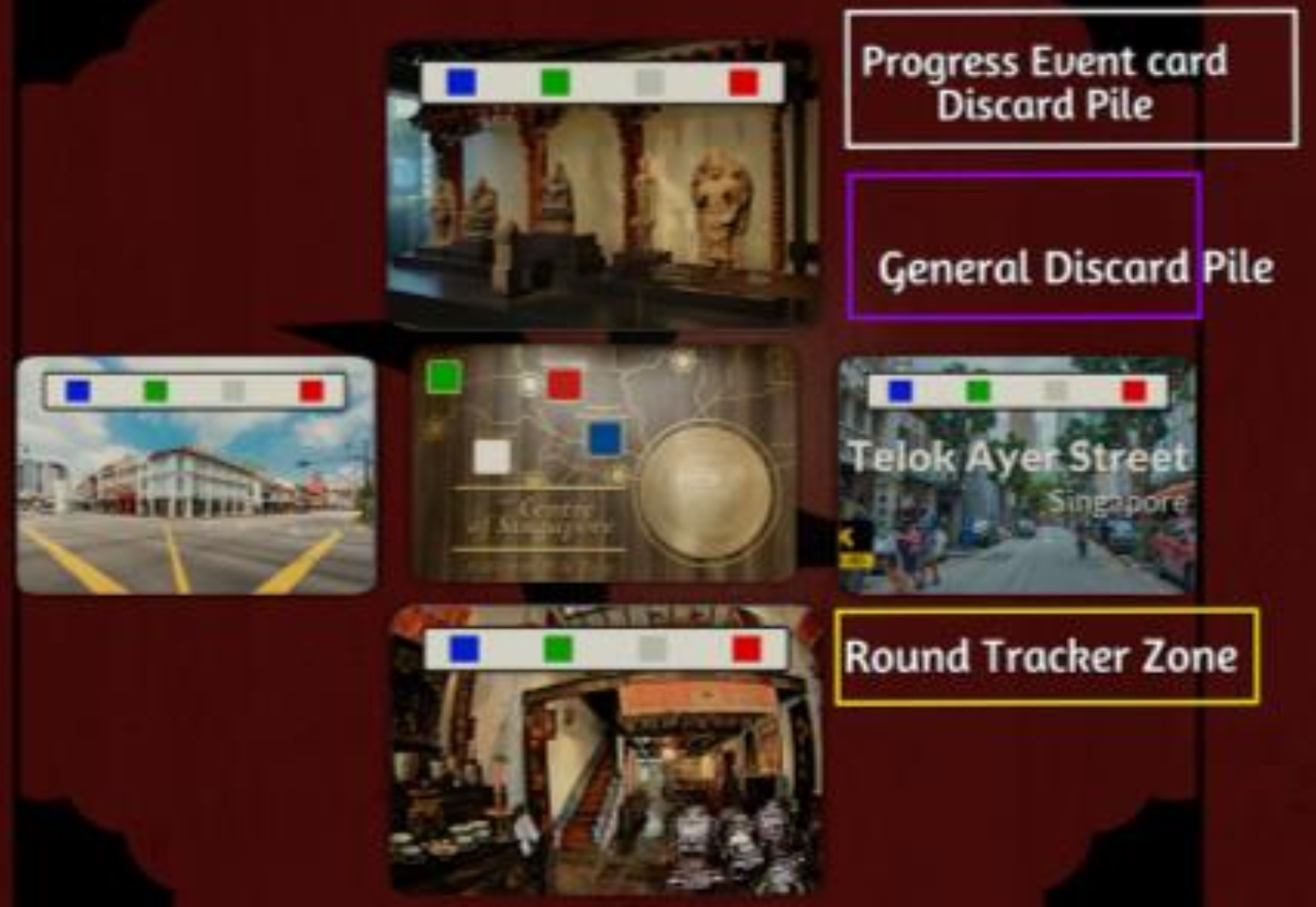
What started from Tabletop Simulator was a very rough idea that Jovis had which incorporates teamwork and strategic planning. During this stage, the game wasn't designed to be in a board form, but rather in a form of various tiles for the players to play on.
This version of the game was designed to be a 4 player game (instead of the current 3), and thus, there used to be more locations for the players to deliver the cultural artefacts.
In the first version, Jovis also designed the game to incorporate different buffs based on the colour pawns you are using. For example, player controlling the white pawn will be allowed to trade with other players for free. However, based on the feedback she gained from the testers, they found that the game was a little too complicated and would exceed the 20 mins play time requirement as set but the lecturer.
Through many tweaks and iterations, Jovis eventually settled down with a simplified version of the game and handed over to the team for comments. The team at this point started to work on prototype and did a few play tests to iron out details and fix any loop hopes found.

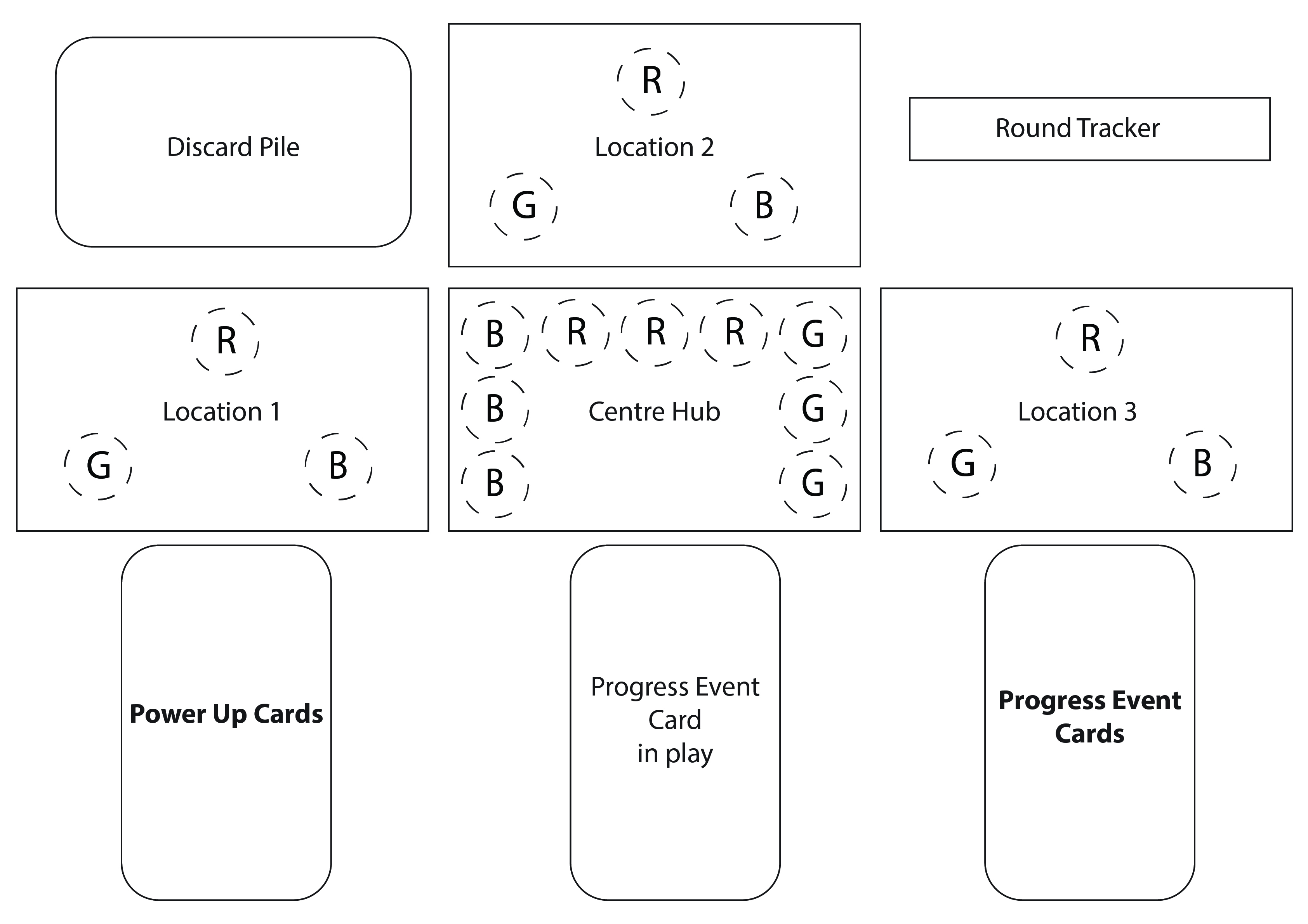
The game's player limit was also reduced to 3 and thus, the team has to redesign the board to reflect the new mechanics and simplified a few elements on the board for better user experience.
During this stage, the team experimented with various changes to the game, like having Progress Event cards to have 2 effects instead of 1, or certain Progress Event cards effects only affect certain players. This, however complicates the mechanics with will in turn affect the user experience.
The team also conducted a few play test sessions and received a few feedbacks to improve on the game. Most feedbacks pointed that the Power Up cards doesn't really have much incentives for player to draw. Thus, the team made the decision to reduce the action points needed to draw a Power Up card from 2 to 1.

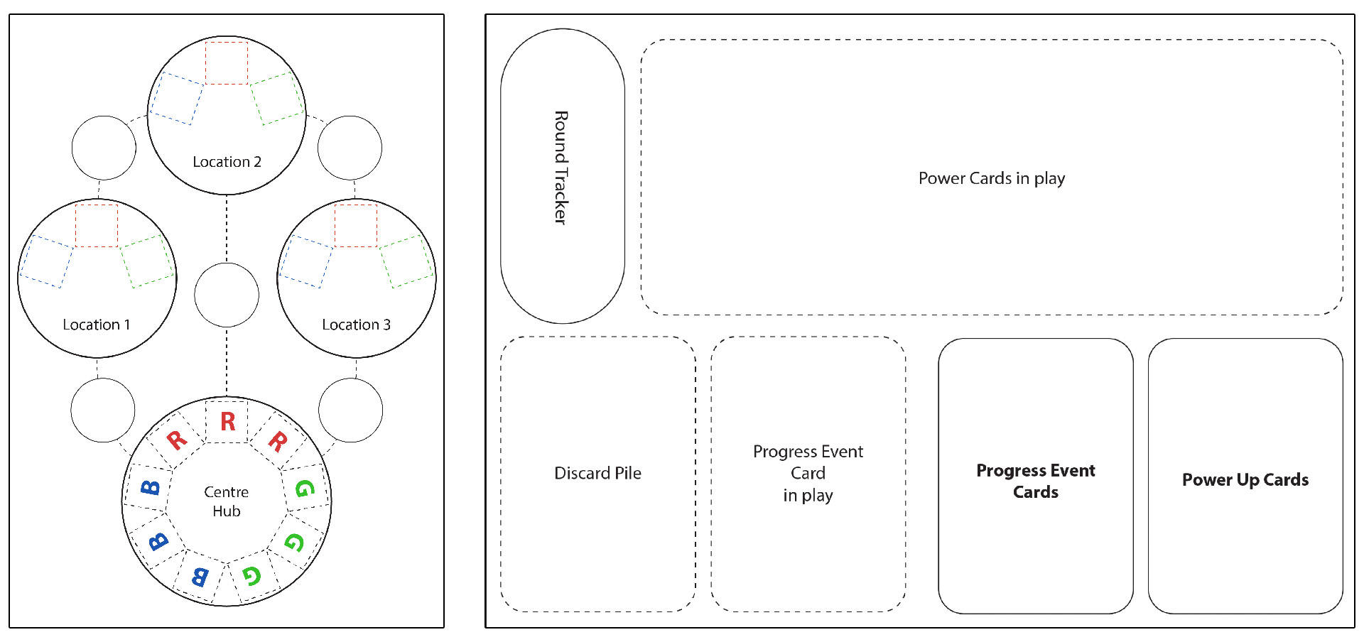
The play test session also had players who feedback that the areas on the board wasn't big enough to lay down the cards, so the team made the decision to split the board into 2 different boards to make space for areas to put down the cards.
This version of the board was then considered as finalised and the lead artist, Quan, started working on all the art assets for the game.
At this stage, the game was pretty much in a finalised state already. The game was quite well received by the general public and this is where the team decided the game has gone gold.
Thus, this is the story of how Time Crunch! is created!
Psssst, Time Crunch! is named as such because it's short for TC, which is Team C, the team name for this project.
Get Time Crunch!
Time Crunch!
Time Crunch! is a 20-minutes strategic racial harmony board game.
| Status | Prototype |
| Category | Physical game |
| Authors | MAGES Institute, c.ningmeng.t |
| Genre | Strategy |
| Tags | Co-op, Cute, Family Friendly, Print & Play |
| Languages | English |

Leave a comment
Log in with itch.io to leave a comment.