Development Process

Before The Adventure of Dragon Slayers ...Or So The Characters In The Game Thought To Be Because Something Peculiar Happened?! turned out the way it look now, let's take a look behind the curtains of how the game was developed.
The very first prototype

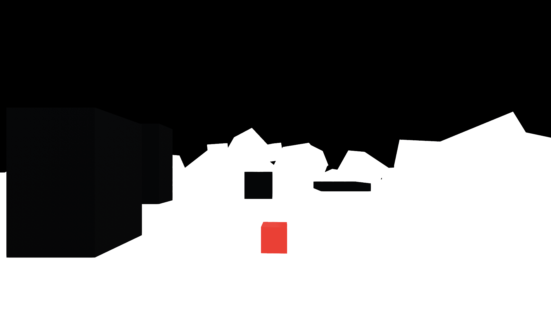
This is how the first prototype of the game look like. (I know right, it looked nothing like how it look now)
I wanted to test how the perspective script when the game is in 2D view works, as well as feasibility check for the project. So I've created a very simple world with the red cube as the playable character and the black cuboids as the platforms. During this stage, the character is able to reach the top of all the platforms only in 2D view. The character at this point wasn't able to move in front of the platforms when grounded, so players wasn't allowed to move freely. My plan was to get the main mechanic system script done first before moving on to experiment on the art style.
Style Test Prototype

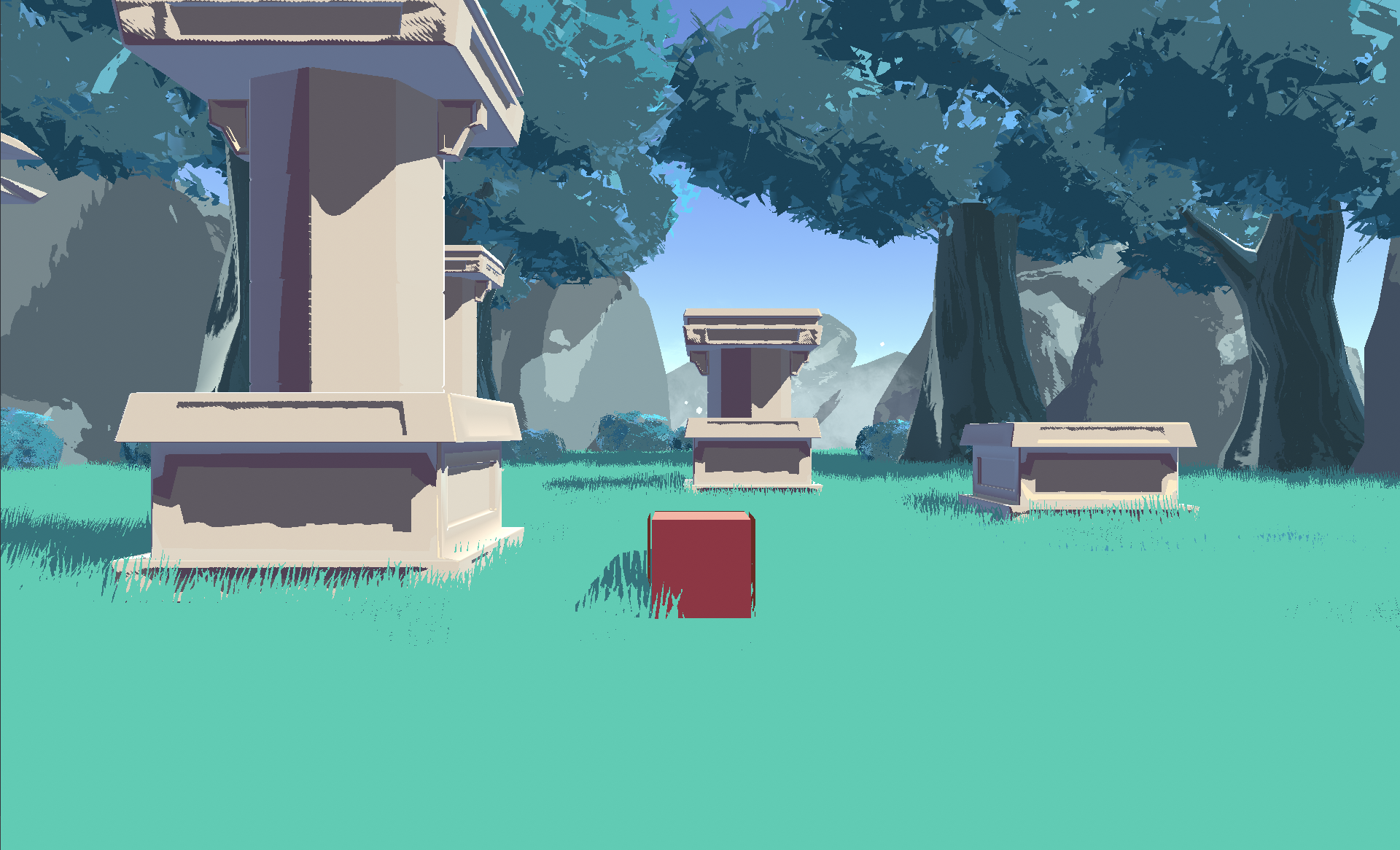
After getting the feasibility checked, I then proceed to try out various art styles and subsequently settled down with a cel-shaded look.
Getting the perspective script to work correctly with the models was a little tricky. Not only the model can only use Box Collider, it also has to have the origin of the model to be on the top of the mesh. So during the modelling stage of the platform (or pillars, in this case), I have to make sure to move the top of the mesh down below the origin point and then freeze the transform before exporting it out to Unity.
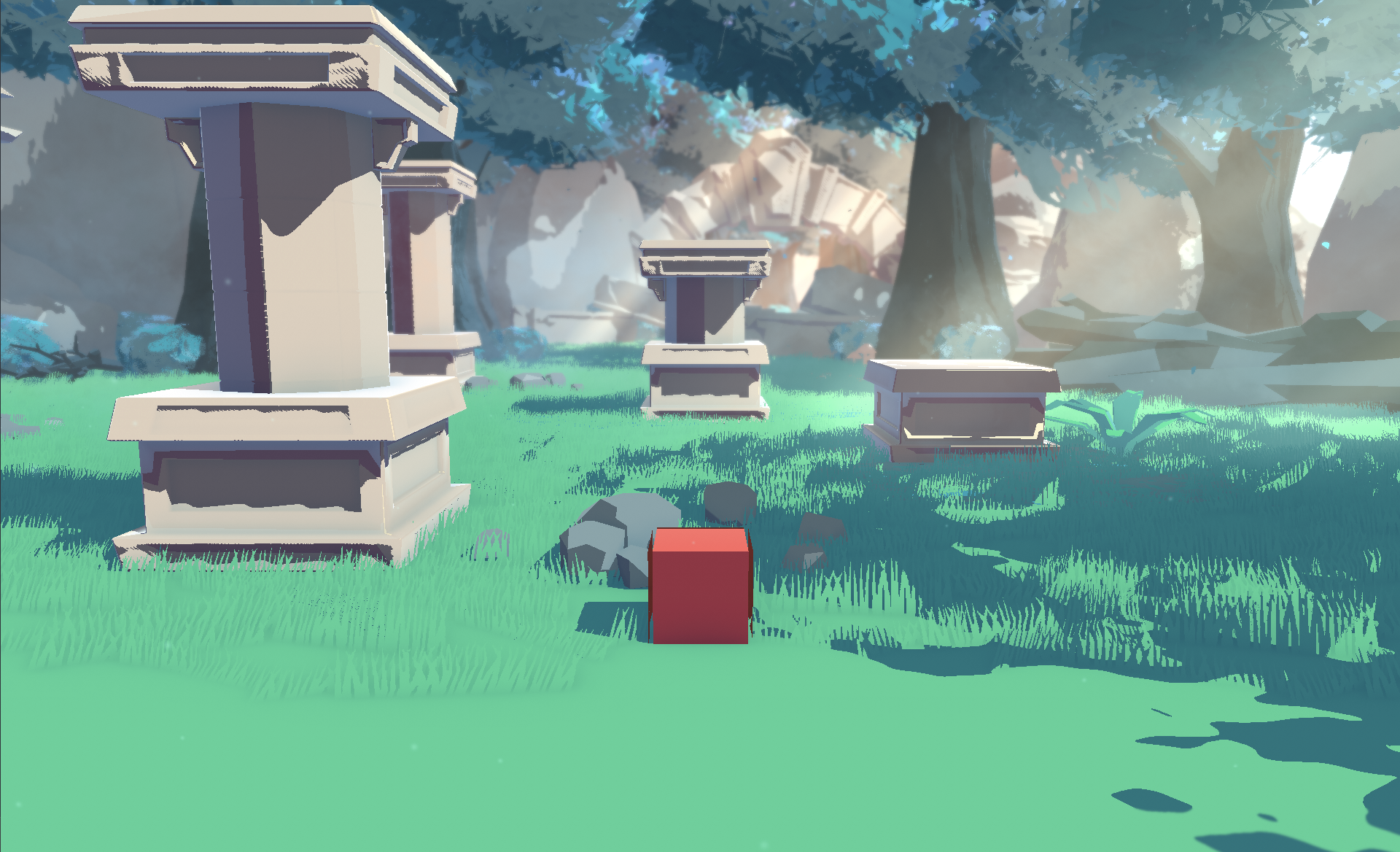
Style Test Prototype 2

I then tested out various post-processing effects to further enhance the look of the game. At this point, I was pretty satisfied with how the style look, so I've proceeded to start the character design and modelling, and subsequently the level design.
Get The Adventure Of Dragon Slayers...?
The Adventure Of Dragon Slayers...?
Not your typical dragon hunting game
| Status | Prototype |
| Authors | MAGES Institute, c.ningmeng.t |
| Genre | Platformer, Puzzle |
| Tags | 2D, 3D, Casual, Fantasy, Perspective, Short |

Leave a comment
Log in with itch.io to leave a comment.